If you’ve ever felt at a loss or completely confused about what colours to choose for a project or what colours to wear, you are absolutely not alone. In fact, writing this article almost made me give up on ever being able to figure out what colours “look good on me”. For a long time, we’ve been knitting giant swatches of each of our hand-dyed colourways — large enough to drape around your neck, next to your face. And for years, I’ve thought about sitting down for a colour draping session to finally get a definitive answer of what looks “best”.
Colour Draping
As a teenager, I spent a good amount of time obsessing over the colour palettes in my mom’s copy of Color Me Beautiful, a book about seasonal colour palettes, trying to figure out what colours I should wear to school. It didn’t make sense to me that the recommendation for everyone with black hair and dark brown eyes would automatically be slotted into the “Winter” season and though I tried, those clear icy winter colours always made me look tired or ill. I just didn’t believe that every Asian person with the same black hair and dark brown eyes would look good in the same colours. So by the end of high school, I pretty much opted to wear black all the time… this way I wouldn’t make any mistakes with my colour choices.
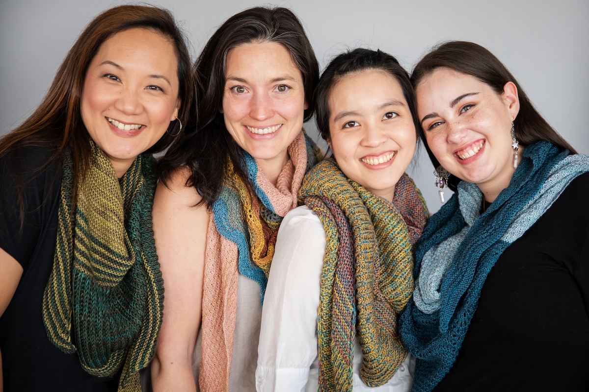
Fast forward to today, where I have long believed that Charlotte and I have totally different colouring, despite our black hair and dark brown eyes. So we did a comparative colour draping session with Rachael (brown hair, green eyes), Greta (dark brown hair, brown eyes), Charlotte (black hair, dark brown eyes), and me (black hair, dark brown eyes). I wanted to really see if there was a difference.
Setting Up for the Experiment
Finding Colour Palettes
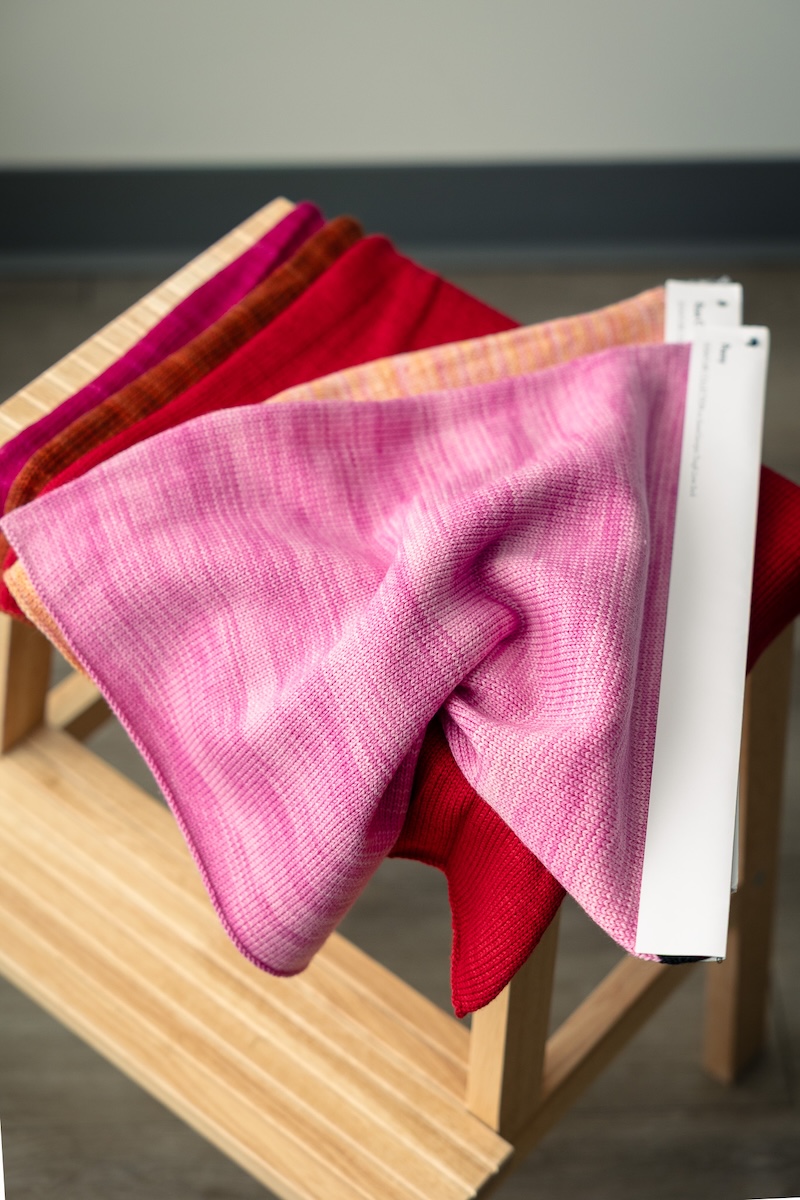
SweetGeorgia dyes over 100 colourways, ranging from a clear and vivid colour wheel, light and dark versions of each colour, and muted versions of each hue too. With all these colourways, we sorted all the swatches by hue family (blue, green, red, etc.), temperature (warm vs. cool), value (light vs. dark), and chroma (vivid and pure vs. dull or muted).
With over 100 colourways, it wouldn’t have been efficient to photograph each of us with each colourway, so we picked a selection of 24 swatches that would help us compare and contrast the colours to observe the differences. We were picking swatches that contrasted between cool colours vs. warm colours, saturated vs. muted, white vs. cream, light vs. dark, and so on.
Variables to Also Consider
As well, we set up a spot by the window for natural daylight and came wearing little to no makeup. One of our team also helped by holding up a light/white reflector to bounce more light into the photo. Our background was a plain white wall and we took all the photos with Brigid’s trusty Canon R6 camera. Brigid shot all the photos and we tried to make observations throughout. Which colours made the person look lighter, brighter, and more healthy or more energetic? We also played with a few additional swatches of each person’s favourite colour (e.g. Greta likes the Papaya colourway and Charlotte likes Mermaid and Magician).
After importing all the photos, I corrected the white balance to match the photos with a ColorChecker and removed the yellow colour cast. This way, we could get the correct white balance in all of the photos to make the comparisons more accurate.
Note that everyone came in wearing a different coloured top, which might have affected the judgement of the colour swatches. If we did this experiment again, we would have everyone wear the same black cape underneath the swatches.
And finally… smiling makes a difference! When you smile in a photo, it makes you light up, no matter what the colour is! We had to try to discount the effect of the smiles when we were making our observations.
Colour Draping Observations
Honestly, this was not as easy as we thought. Laying swatch after swatch, it was challenging to always be observing changes to the subject’s skin tone. Often we would be smitten with the colour of the swatch, making it difficult to offer objective feedback. Sometimes we swung between “all the colours look good on you” and “none of these colours look good on you”.
We were comparing white vs. cream. Campfire (burnt orange, warm red) vs. Dragon Fruit (magenta, cool red) vs. Cherry (true red). Atlantis (dark clear, deep blue) vs. Hydrangea (pale, clear, icy blue). Brass (deep muted gold) vs. Honey Gold (pale muted gold). With just a handful of swatches, I began to notice where white looked better on Charlotte, but cream looked better on Rachael, Greta, and myself.
After a long look, I landed on these results:
Rachael Lee
This one was super tricky… I flip-flopped between warm and cool, Autumn and Summer, because I think Rachael looked pretty great in all of the colours! So, by process of elimination, I saw that the really vibrant and saturated colours like Dragon Fruit, Huckleberry, and Papaya overwhelmed her skin tone, so that hinted that she would look better in softer, more muted hues.
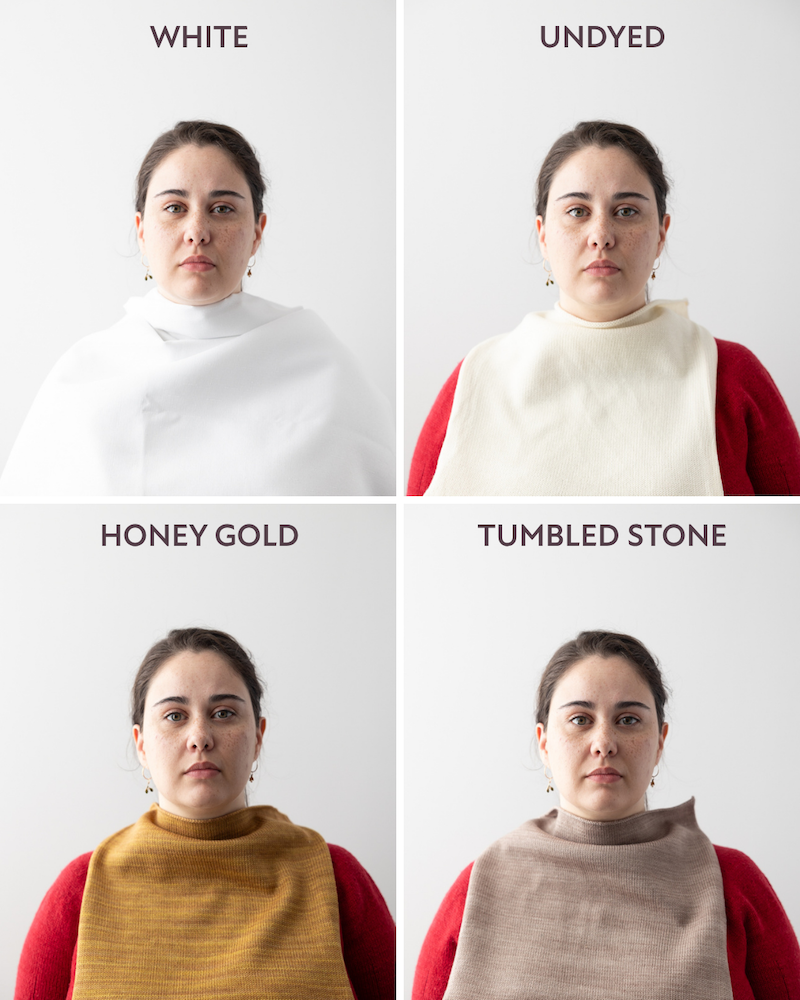
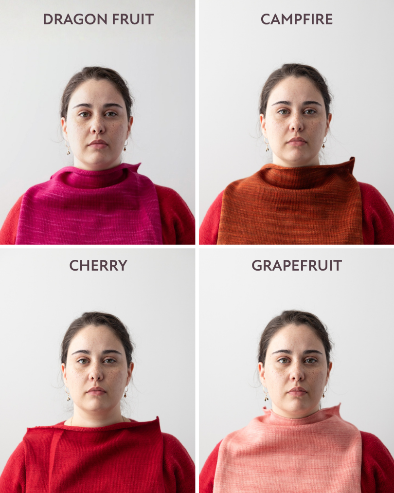
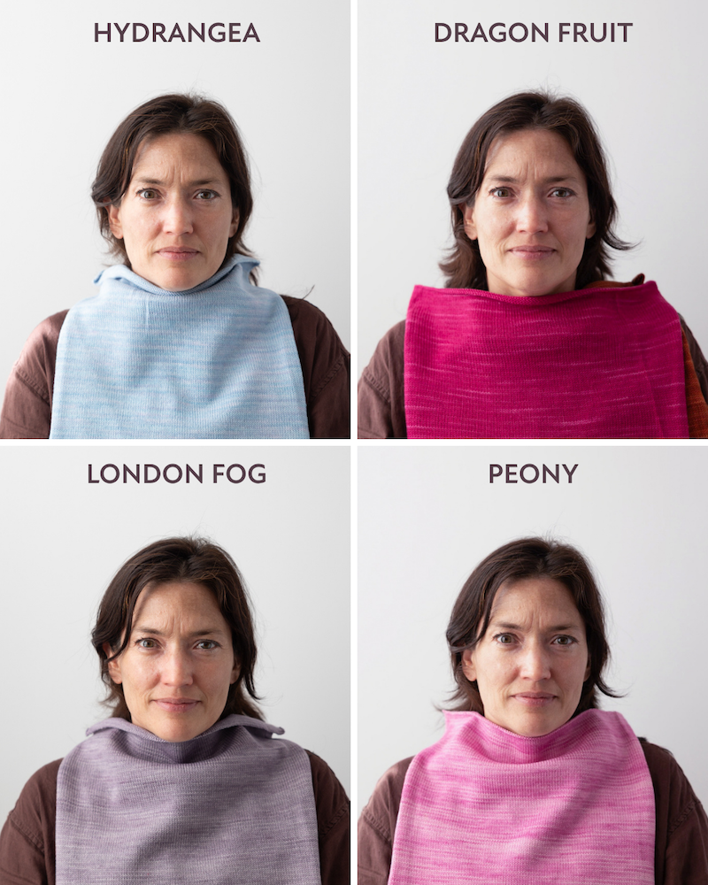
Very clear and light colours like Peony, Rose Gold, and Hydrangea also washed her out, while the dark colours like Atlantis were too heavy. So, looking at those mid-tone, muted and warm colours seemed to fit best — colours like Campfire, Brass, Blue Canoe, and Equinox work well.
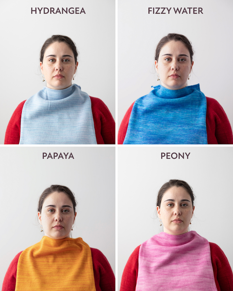
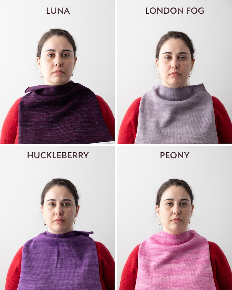
Overall, I think Rachael is most likely a Soft Autumn or possibly a True Autumn. She would look great in colours like rust, terracotta, camel, honey gold, olive, sage, soft teal, dusty blue, mauve, rose-brown, warm taupe, and cream.
Greta Cornejo
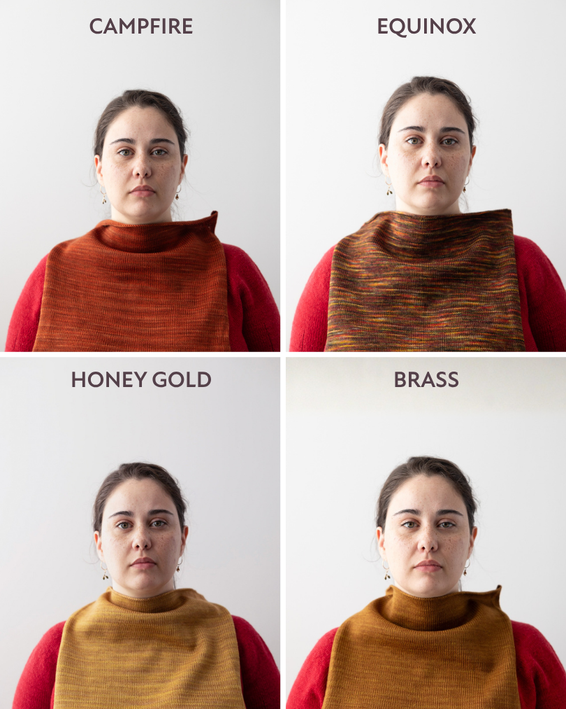
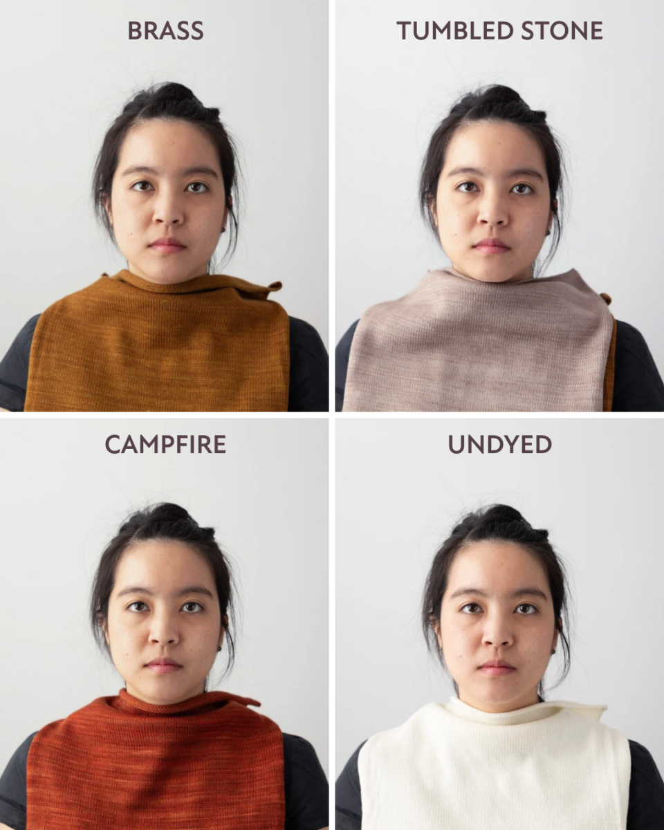
She looks great in gold! And with Greta’s dark hair and eyes, she hovers between True Autumn and Dark Autumn. While Greta can wear the darker colours well, her skin seems to glow when paired with the rich and vibrant burnt orange of Campfire, the deep gold of Brass, and the warm colours of Honey Gold and Rustic.
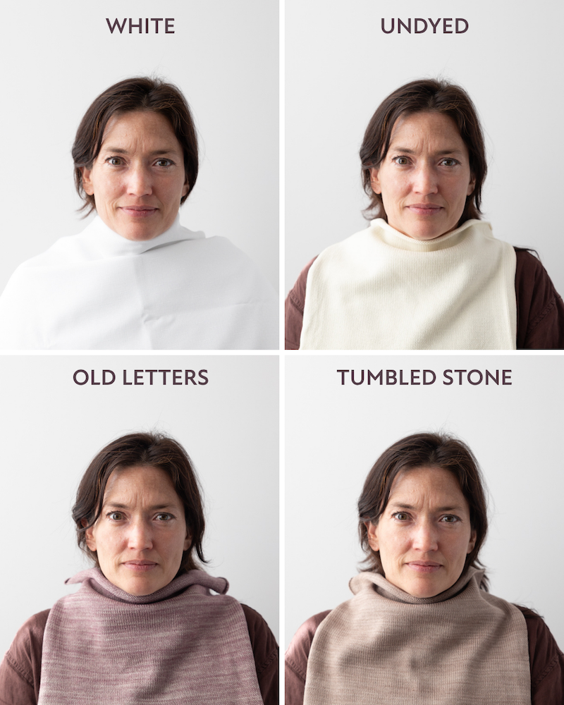
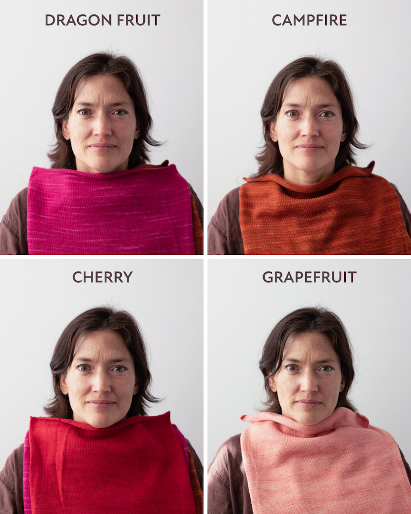
The Cherry red is also good on Greta, but the deep dark blue of Atlantis doesn’t lift her skin tone in the same way. The muted colours of Blue Canoe, Old Letters, Portobello, and Tumbled Stone seem to just blend in rather than lighting her up. Interestingly, the really cool and vibrant colours like Fizzy Water and Dragon Fruit seem to make her skin look a bit more ruddy and red.
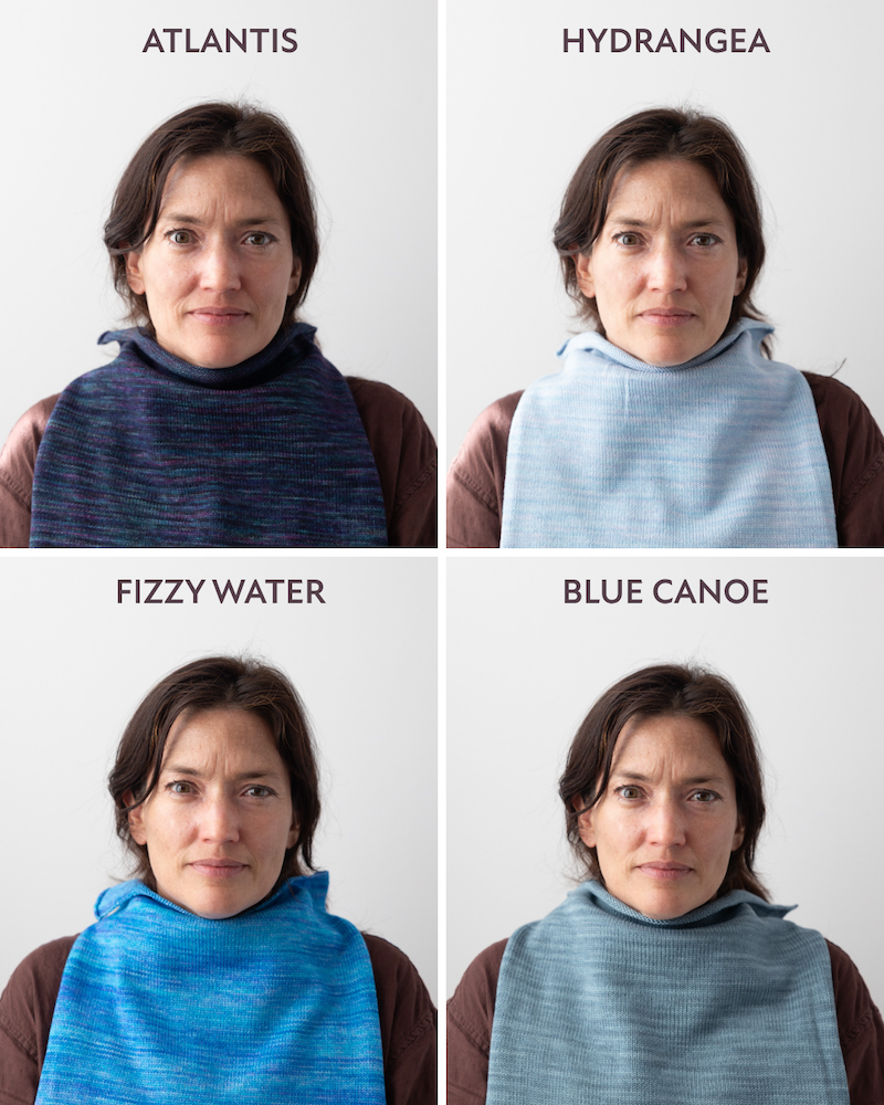
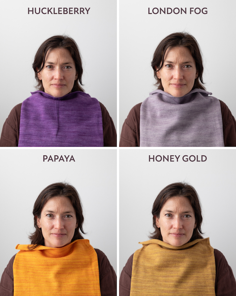
Light colours, whether cool like Peony or warm like Grapefruit, will tend to wash her out. So the depth of colour matters more than the temperature of the colour here. Finally, the cream is nicer than the white on Greta. Overall, Greta looks best in warm, rich colours and can carry some depth. Think rust, copper, brass, honey gold, olive, chocolate, and cream.
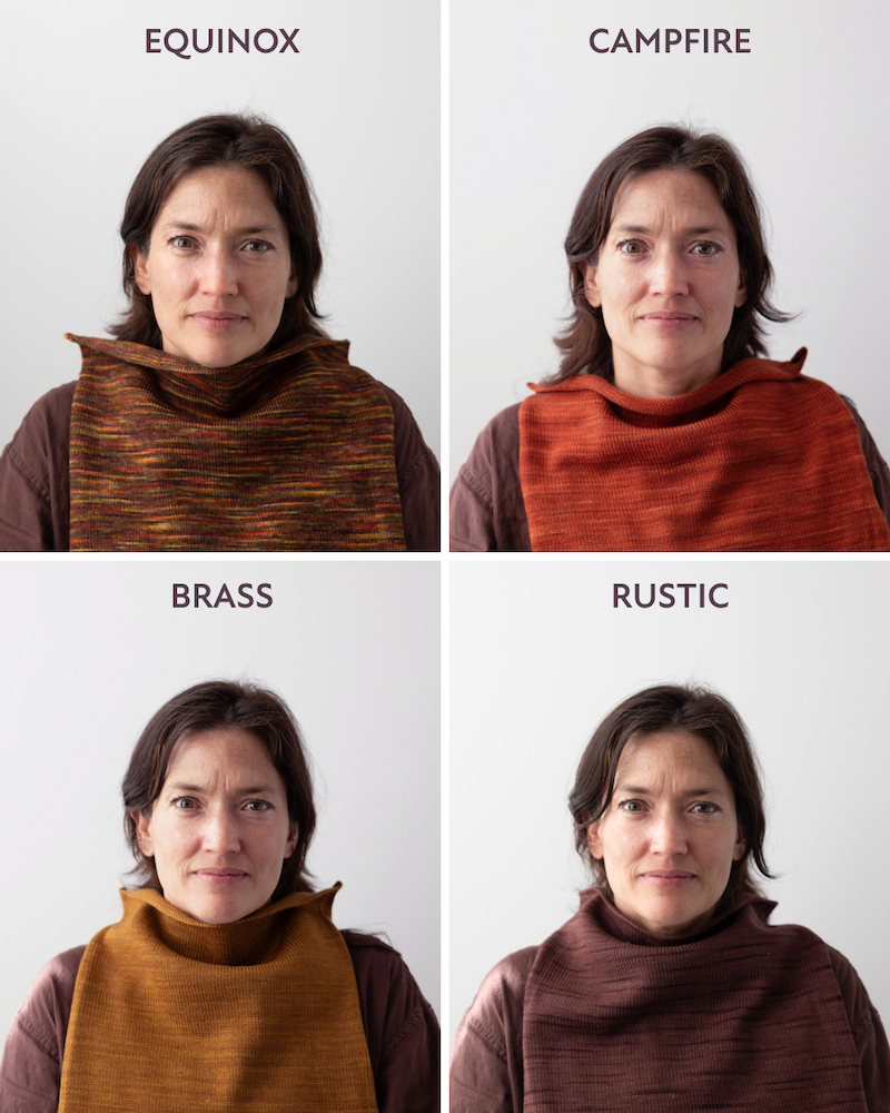
Charlotte Lee
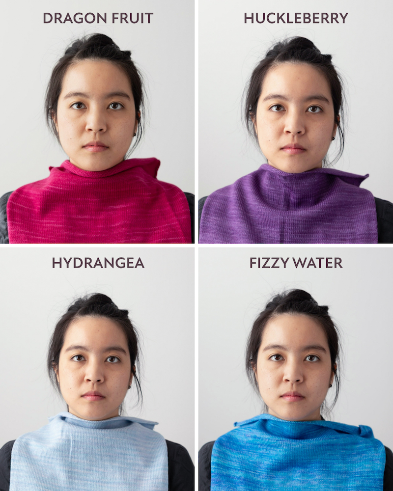
I thought Charlotte looked fabulous in the clear, cool, and vibrant colours of Dragon Fruit, Cherry red, Fizzy Water, as well as the darker colours of Luna and Atlantis.
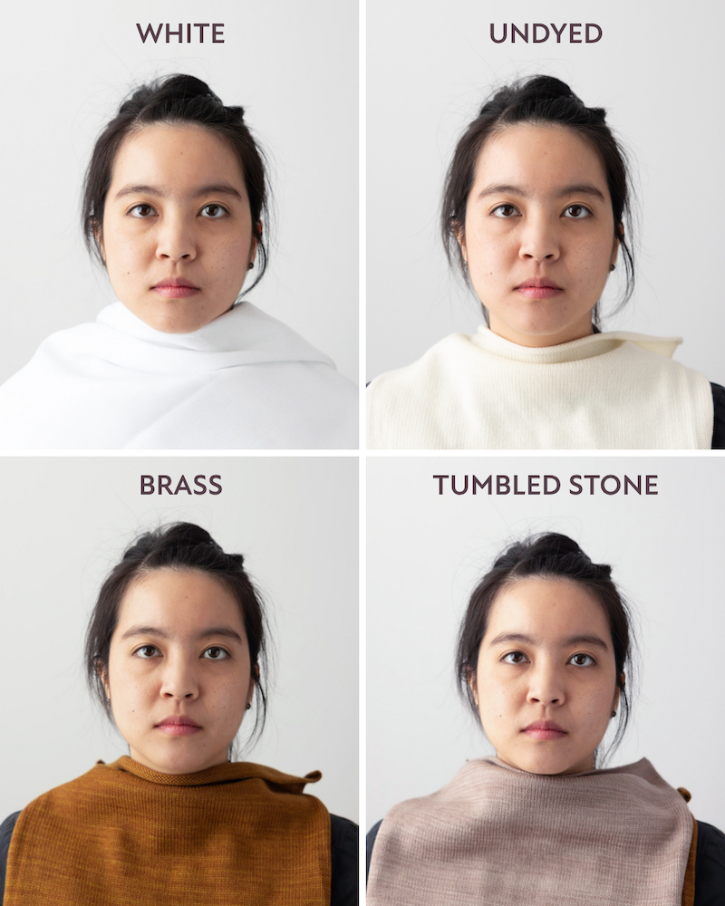
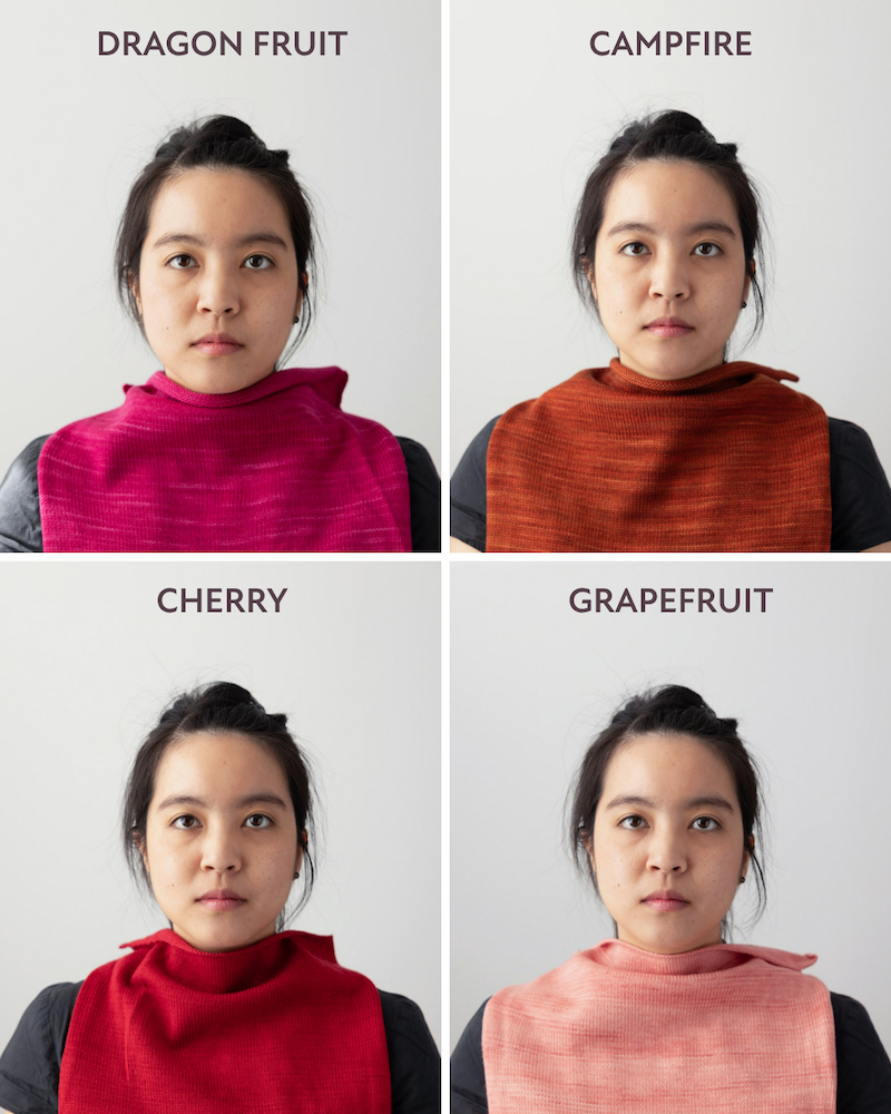
She definitely is able to carry the cool, crisp colours, including pure white and Huckleberry purple. This is obvious when you see Charlotte in the warm colours like Brass and Campfire — her skin starts to look a bit yellow and not as bright.
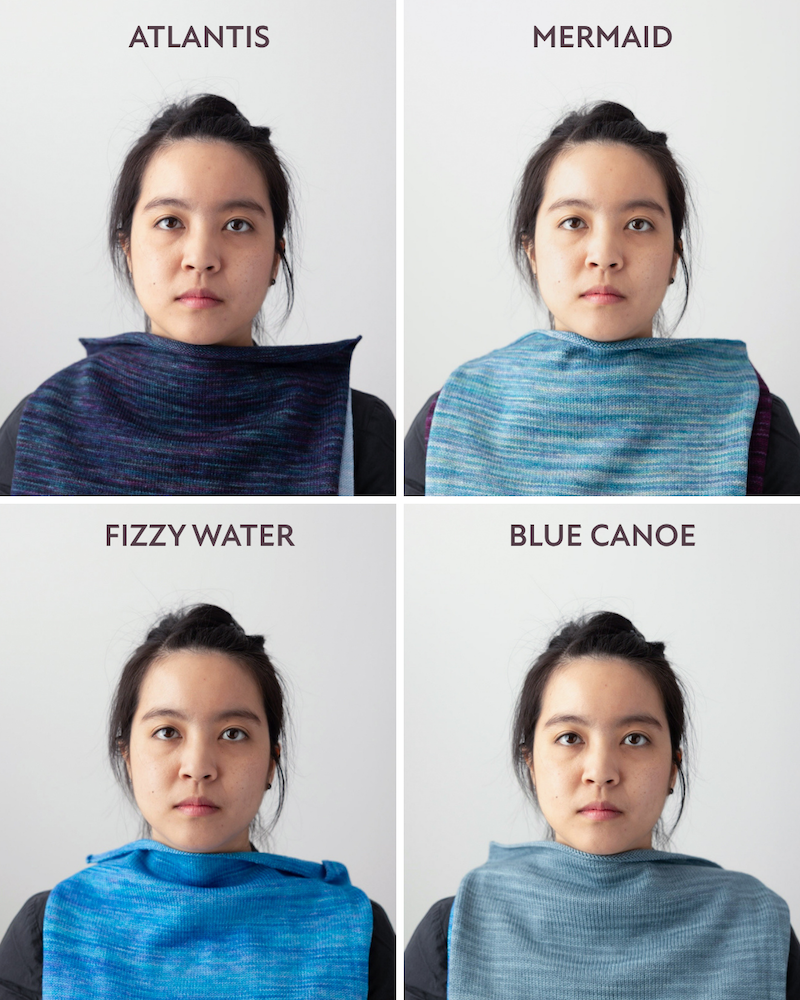
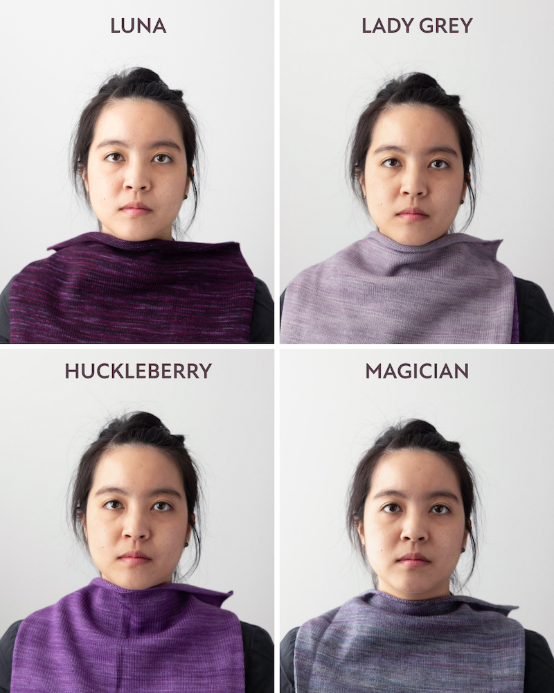
The muted colours like Portobello and Blue Canoe were more flat and didn’t do much to light up her face. But I think Charlotte is a True Winter or Bright Winter because pretty much every warm or muted colour takes second place to the cool, vibrant, and bold colours.
Felicia Lo
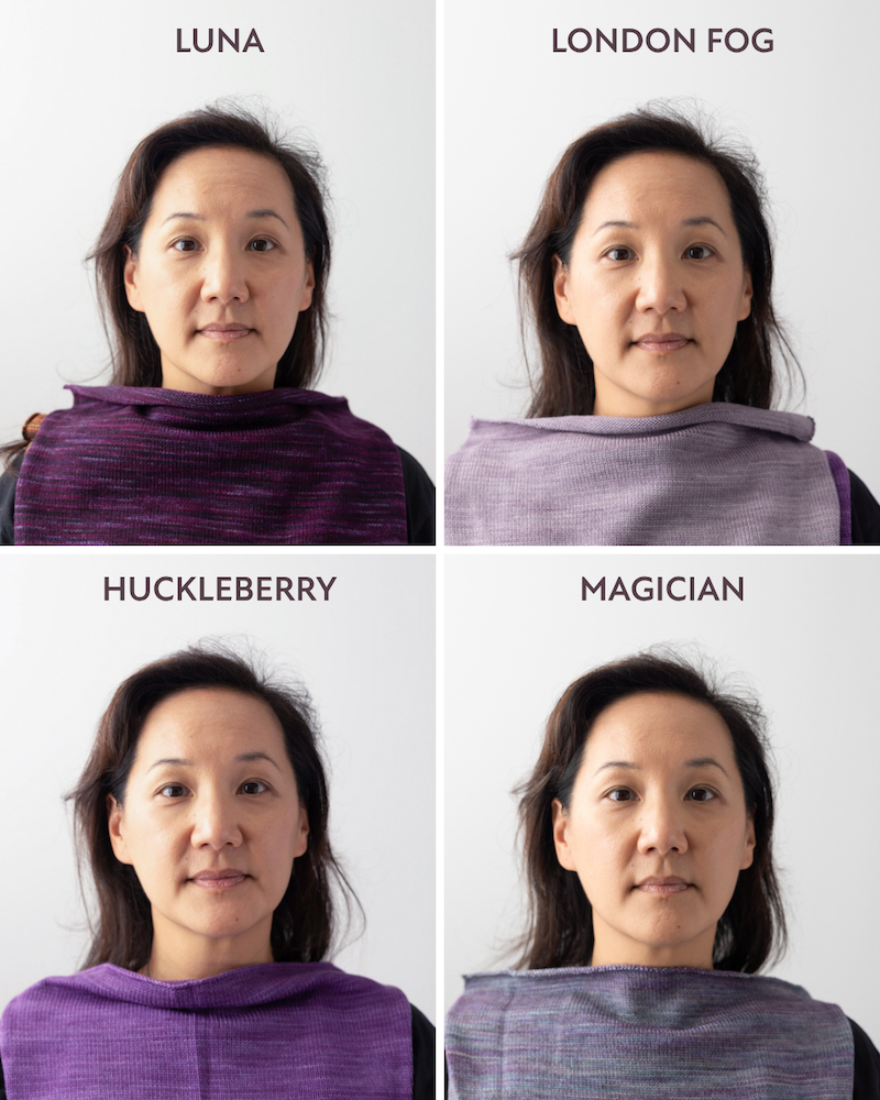
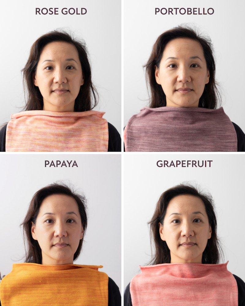
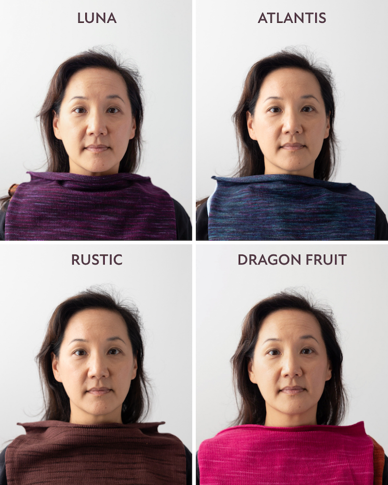
Personally, I think and have always thought that I’m the hardest to decipher. All I can tell is that my skin tone can carry depth and vibrant colours, and when the deep cool and the deep warm colours went head to head, the cool colours looked better. I think I’d be considered a Dark Winter leaning towards Dark Autumn, meaning I can wear dark, saturated, and cool colours (like Atlantis and Luna) but also borrow some dark warm colours (like Rustic or Arbutus).
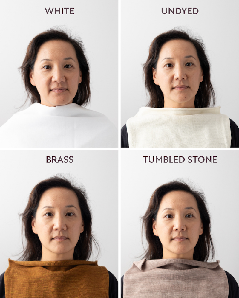
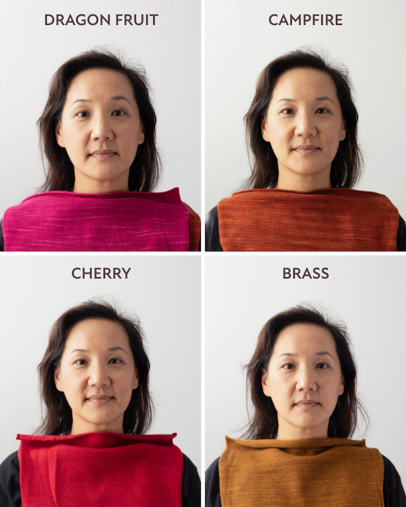
The muted colours like London Fog and Magician really look flat on me and make me look tired and almost grey. While I can wear the deep, dark, warm colours, it’s harder for me to wear the mid-tone and lighter warm colours like Brass and Honey Gold — they make my skin tone look yellow.
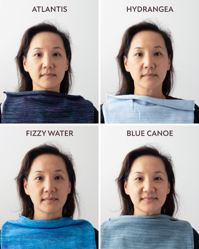
And all the lighter colours, whether they are warm like Creamsicle or Grapefruit or cool like Hydrangea, all make my skin look quite washed out. I’ve always loved the autumn and deep autumn colour palette and wished I could wear them all, but this swatch and draping experiment sort of showed me how those mid-tone warm colours just don’t suit me.
Colour Draping Conclusions
Out of these observations, you might notice that, yes, Charlotte and I both have black hair and dark brown eyes and both ended up as “Winters” but the difference is the type of Winter. For me, being a Dark Winter, the depth of colour matters most and I would thrive in deeper, darker colours, whether they were cool (better) or warm (not bad). For Charlotte, being a True or Bright Winter, the clarity and saturation of the colour matters most and she thrives in a cool, vibrant hue. We might both be Winters but we are not the same. This is the reason the icy cool blue works for Charlotte but doesn’t work for me.
Choosing Colour Over Drape
I know that some of Charlotte’s favourite colours are Mermaid, Magician, and London Fog. One of Greta’s favourite colours is Papaya. Rachael came into our session wearing a gorgeous hand-knit sweater she made in Cherry. And my favourite colour (right now) is our dark mossy green Lichen colour. Do these colour findings mean that we can’t wear or enjoy these colours anymore? Not at all! There are plenty of ways to enjoy favourite colours — whether that is knitting them into accessories, socks, or garments.
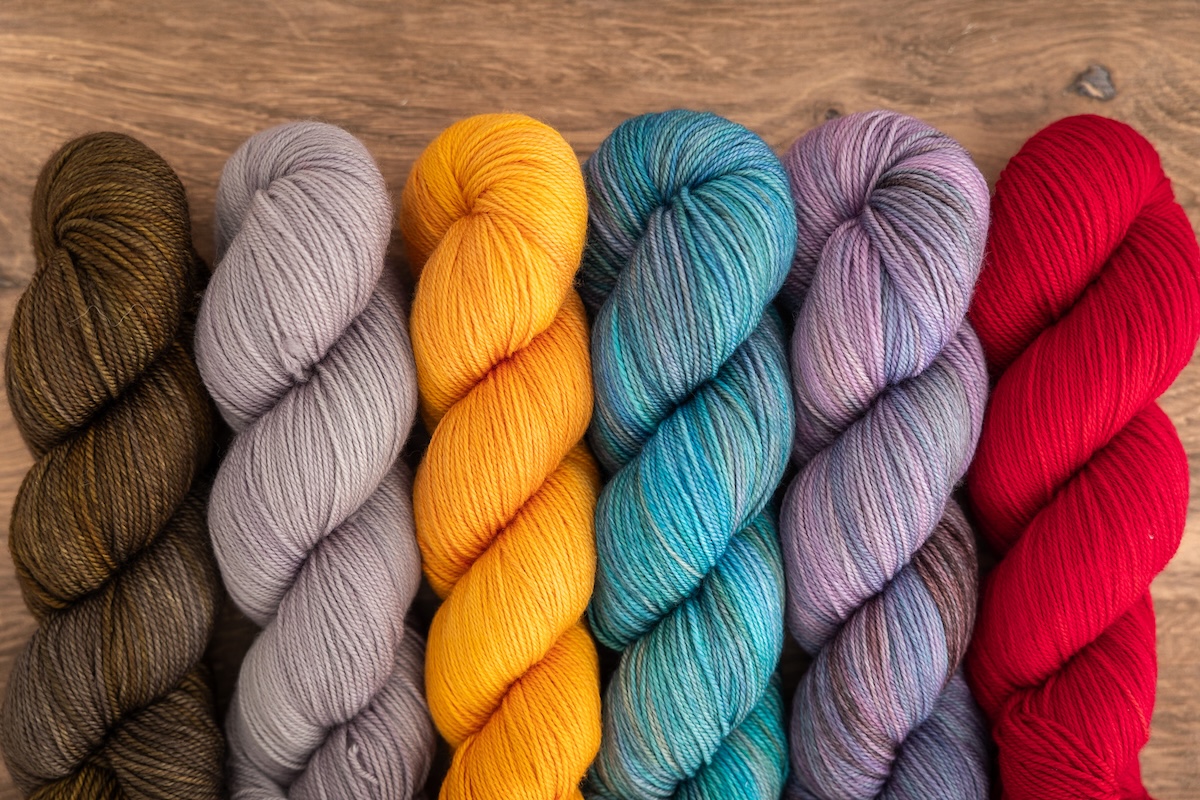
Of course, we can argue that we should all just wear whatever colours we like! I will always champion indulging in and enjoying whatever colour you like! Ultimately, the idea is to wear colours that make you feel good. Wear colours that make you happy! For me personally, I know that yarn supplies and the time and effort spent making something are so precious; it’s worth it to me to invest in colours that will lift me up, give me a boost of energy, and make me look and feel healthier. This is the power of colour to literally change how you see yourself.
The post Do-It-Yourself (or with Friends) Colour Analysis Draping appeared first on SweetGeorgia Yarns.